CASE STUDY / DESIGNOPS · MENTORING

DesignOps in a Small Team — Scaling Quality Without Adding Senior Workload

Design team of 4 · 4-element quality system · 2–3× fewer iterations after handoff · ⅓ of senior time freed · 6 months

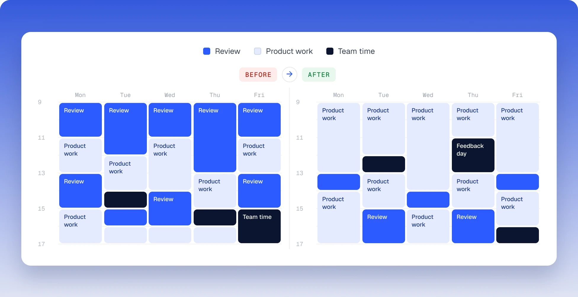
A senior designer’s week before and after the system: before, review blocks crowd out product work every day; after, the week is mostly product work, with short reviews and one feedback day

COMPANY

Under NDA

DOMAIN

B2B SaaS · no-code platform

DURATION

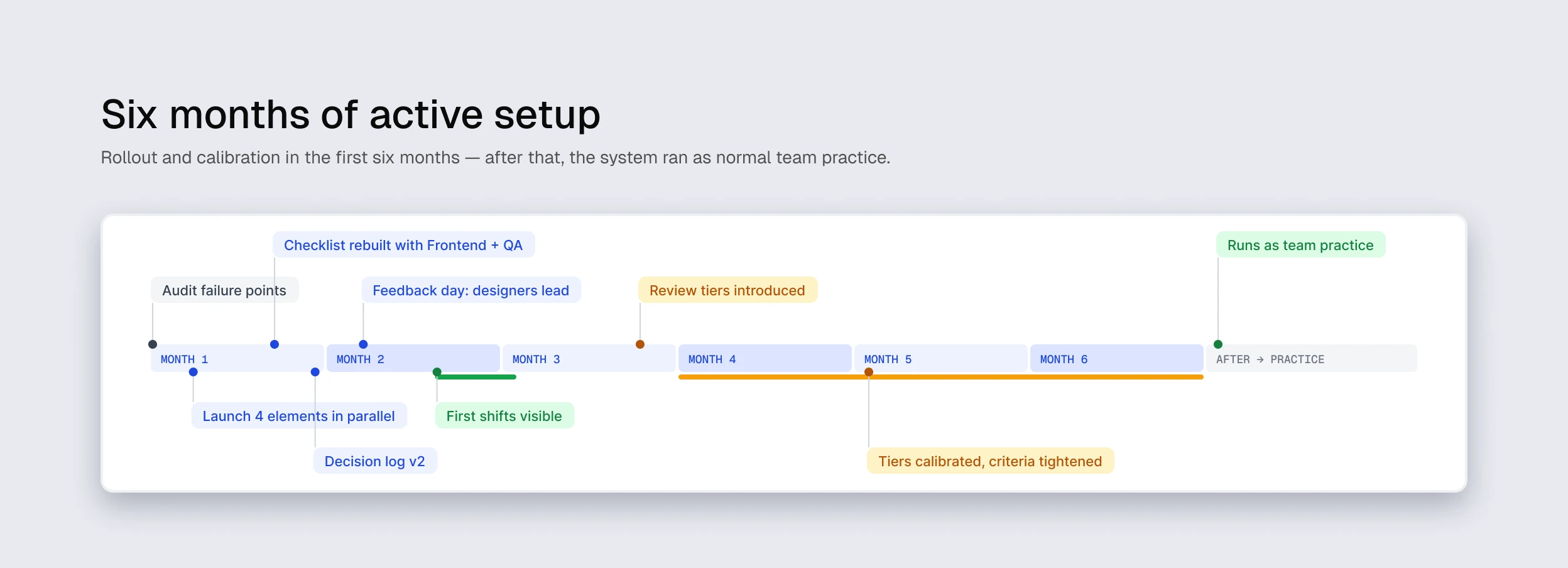
6 months of active setup

TEAM

1 senior (me) + 3 designers + Frontend + PM + QA

TYPE

DesignOps · Process design · Scaling quality

STATUS

Complete · runs as team practice

TL;DR

Quality as a team system

The product team was growing — the design backlog stopped fitting one designer, and the design team grew to four: me and three designers. The default model “senior reviews every screen before handoff” breaks under those conditions: the senior becomes a bottleneck for all design output, and the team has no shared quality criteria — they live in the senior’s head.

I built a system of four elements — handoff quality checklist, decision log, feedback days, routine/non-routine review tiers — that moves objective quality criteria from the senior’s head into team tools. In ≈3–4 months, iterations after handoff dropped 2–3×, about a third of my weekly time freed up for primary product work, and Frontend and QA started engaging with design earlier — at the flow stage instead of the final screen.

Metrics are qualitative and ranged, not statistical — the Results section shows how I separate the system’s effect from the designers’ natural growth.

RESULTS

What shifted.

ITERATIONS AFTER HANDOFF

2–3×

fewer · qualitative, ranged

SENIOR REVIEW TIME

–⅔

review time per week

WORK NEEDING REVIEW

50–60%

down from ≈100%

Metric

Before

After

Iterations after handoff (dev/QA back to design)

baseline question flow

2–3× fewer

Share of design output requiring my review

≈100%

≈50–60%

My weekly time on review

majority of focus

≈one third of baseline

“Where is this decision recorded?” — questions from PM/dev

regular

rare, decision log exists

Routine tasks at handoff

2–3 review passes

one review or none

Four designers, three of them inside the system. Directional evidence from four converging sources — not statistics.

HOW I SEPARATE SYSTEM EFFECT FROM NATURAL GROWTH

The weakest point of a case like this is the small sample: it’s easy to confuse “my system works” with “the designers just grew.” Three independent signals separate the effects. My review load dropped in a step across all three designers at once, not gradually as individuals improved — that points to a tooling effect, not individual growth. PM and Frontend commented on the process, not on output quality (fewer review cycles, fewer questions about states and tokens) — the tool closing questions, not people guessing answers. Shifts showed up within ≈6–8 weeks of launching the checklist and decision log — earlier than anyone could plausibly internalize the same depth through experience alone. A team of four is still a small sample — but three signals from different sources are stronger than one.

01 — CONTEXT

Four designers, one quality bar.

The product is a B2B no-code platform where teams build operational dashboards and workflow automations. Dense screens, many states, real cost of errors in production. PM and Frontend expect design output from every designer at one quality bar — for them “the design team” is one stream of quality, not four parallel tracks. No window for a slow ramp-up: features ship now, and every designer writes into the shared backlog from week one.

This runs in parallel with my primary product work, including the Design System build and the onboarding redesign. No room for a gap between “setting up process” and “shipping product” — the system has to run in the background.

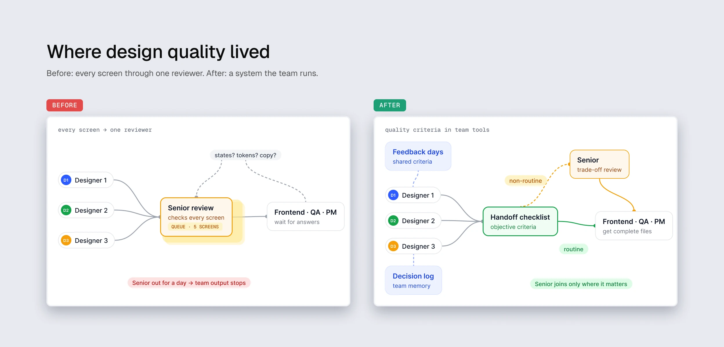
Where design quality lived. Before: three designers queue every screen for one senior review while Frontend, QA and PM wait for answers. After: a handoff checklist holds the objective criteria, feedback days and a decision log support the team, and the senior joins only for non-routine trade-offs

Design quality lived on my personal attention. That scales to one designer. At two it strains. At four it breaks.

PROBLEM

The default model “senior reviews every screen before handoff” was breaking in both directions.

Bottleneck on senior. Three designers bring work and wait for my review while I’m in a primary task — reviews pile up, the sprint stalls. If I’m out for a day, the team’s output stops.

Quality criteria locked in one head. When I review every screen, the team learns “what passes Vlad” instead of “what makes a screen ready.” Dependency on my judgment forms instead of a shared system.

Handoff breaks at the same places. Frontend and QA come with the same questions every time: states, edge cases, tokens, copy. The answer is “I’ll check with Vlad” — back through me.

Decisions get lost. Why this pattern and not that one? A month later nobody remembers. The team has no memory outside mine.

02 — MY ROLE

What I designed, what I shared.

LED

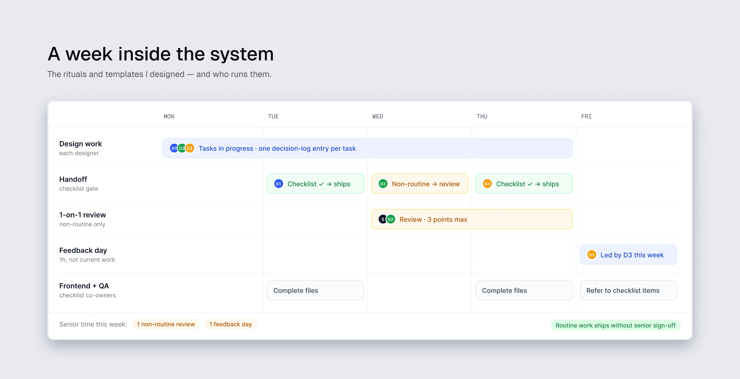
Design of the 4-element system (checklist, decision log, feedback days, review tiers) · templates for handoff checklist and decision log · team rituals (feedback days, 1-on-1 reviews before handoff) · alignment with PM on the routine/non-routine transition

WITH THE TEAM

Expectation calibration with PM · joint rebuild of the handoff checklist with Frontend and QA (what they actually need vs. what I thought they needed) · QA feedback on missed states and edge cases

A week inside the system: design work with one decision-log entry per task, handoffs through the checklist, one non-routine review capped at three points, a feedback day led by a designer, and complete files for Frontend and QA

03 — PROCESS

Six phases, none landed perfectly first try.

01

STEP

Audit failure points

Where does the senior-dependent model break? Bottleneck moments, recurring handoff questions, lost decisions.

02

STEP

Separate ritual from standard

Define what’s objective (checklist) vs subjective (review). They do different jobs.

03

STEP

Launch four elements in parallel

Checklist + decision log + feedback days + 1-on-1 reviews. Not sequential — they reinforce each other.

04

STEP

Iterate based on reactions

Designers, Frontend, QA and PM each react differently. Calibrate templates to what they actually need.

05

STEP

Shift to self-validation

Routine vs non-routine criteria. Each designer decides “ready for handoff” via the checklist, not via a senior nod.

06

STEP

Ease control

Tiers split work into “ships through handoff alone” vs “needs trade-off review.” Senior plugs in only where actually needed.

Six months of active setup: audit of failure points, four elements launched in parallel, checklist rebuilt with Frontend and QA, decision log v2, designers leading feedback days, first shifts visible, review tiers introduced and calibrated — after that the system runs as team practice

CORE BET

Four elements aren’t four independent rituals — they’re one system with different roles. Run any element alone and it doesn’t hold. The strength is in the combination.

DIDN’T WORK → REBUILT

None of the four elements worked in its first version. Four calibration moments kept in the case deliberately — they show the mechanic, not a plan that landed perfectly.

Decision log

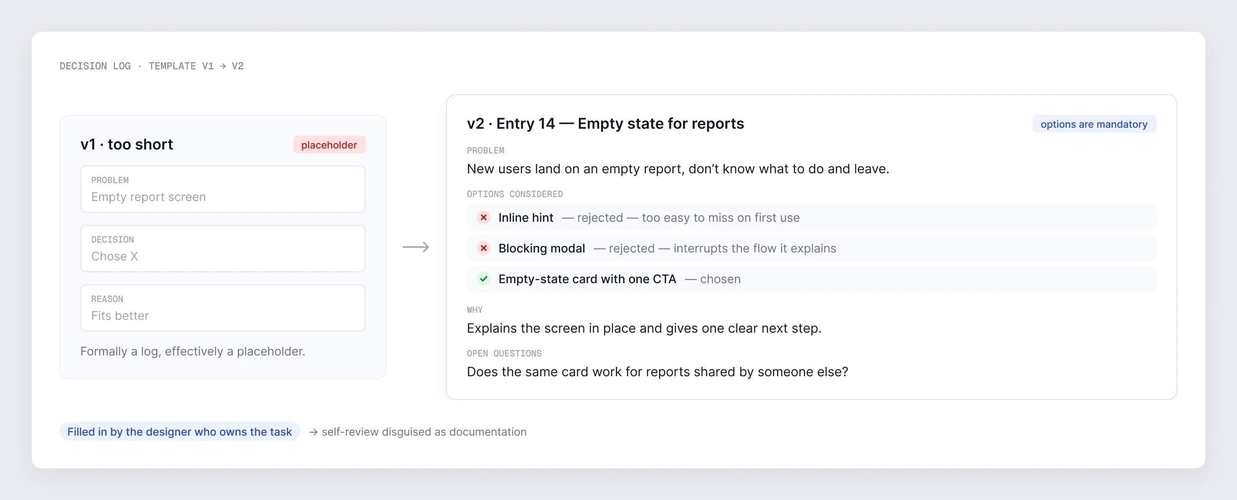
First template was short (problem — decision — reason), and entries came back as “chose X / fits better” — formally a log, effectively a placeholder. Rebuilt with mandatory option fields and rejection reasons for each. Filling it shifted from formality to a thinking tool.

Feedback day

I picked the topics initially — the room stayed passive. After a month, switched format: each designer picks a topic in turn and leads, I ask questions. Engagement jumped, and I learned what actually interested the team.

1-on-1 review

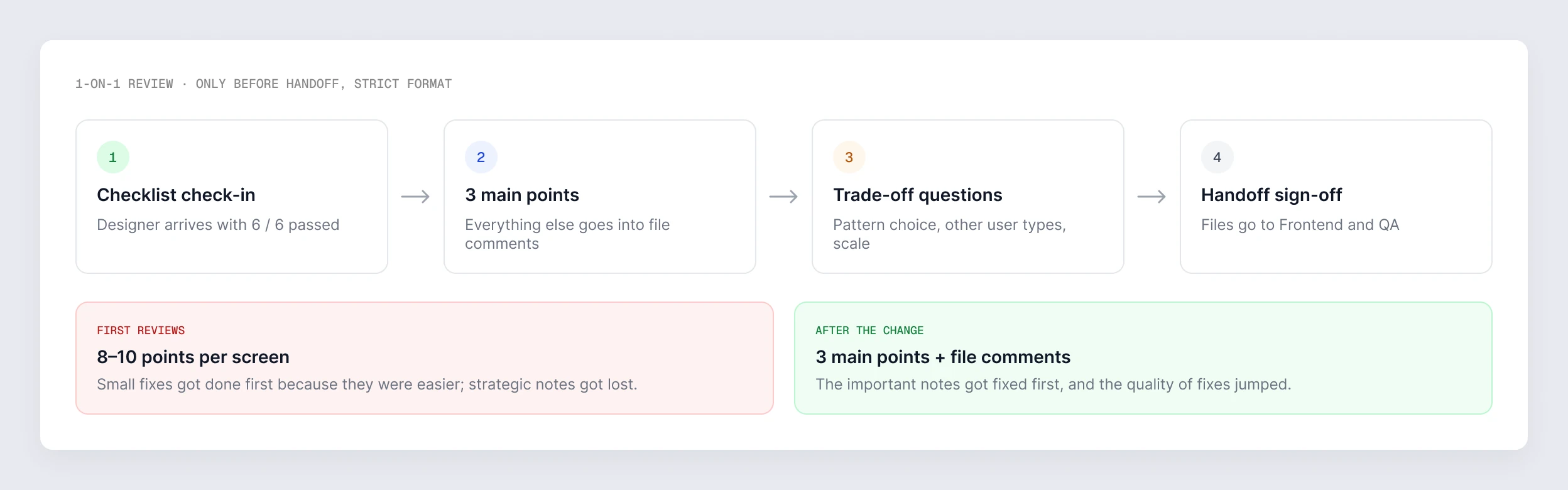
First reviews I dumped everything — 8–10 points per screen. Designers fixed small things first because they were easier, strategic notes got lost. Constrained myself to 3 main points per review, the rest as file comments for solo work. Quality of fixes jumped.

Handoff checklist

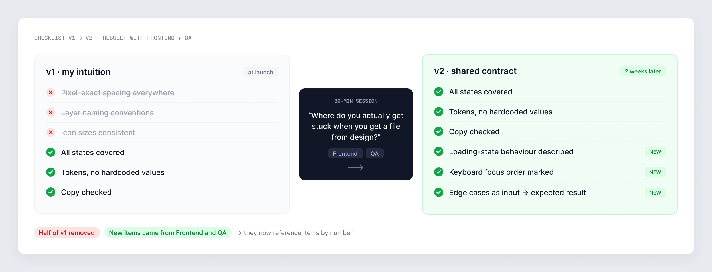
First version was my intuition; two weeks in, mismatch with what Frontend and QA actually needed. Rebuilt in a joint session — covered in Decision #2.

04 — KEY DECISIONS

Six calls behind the system.

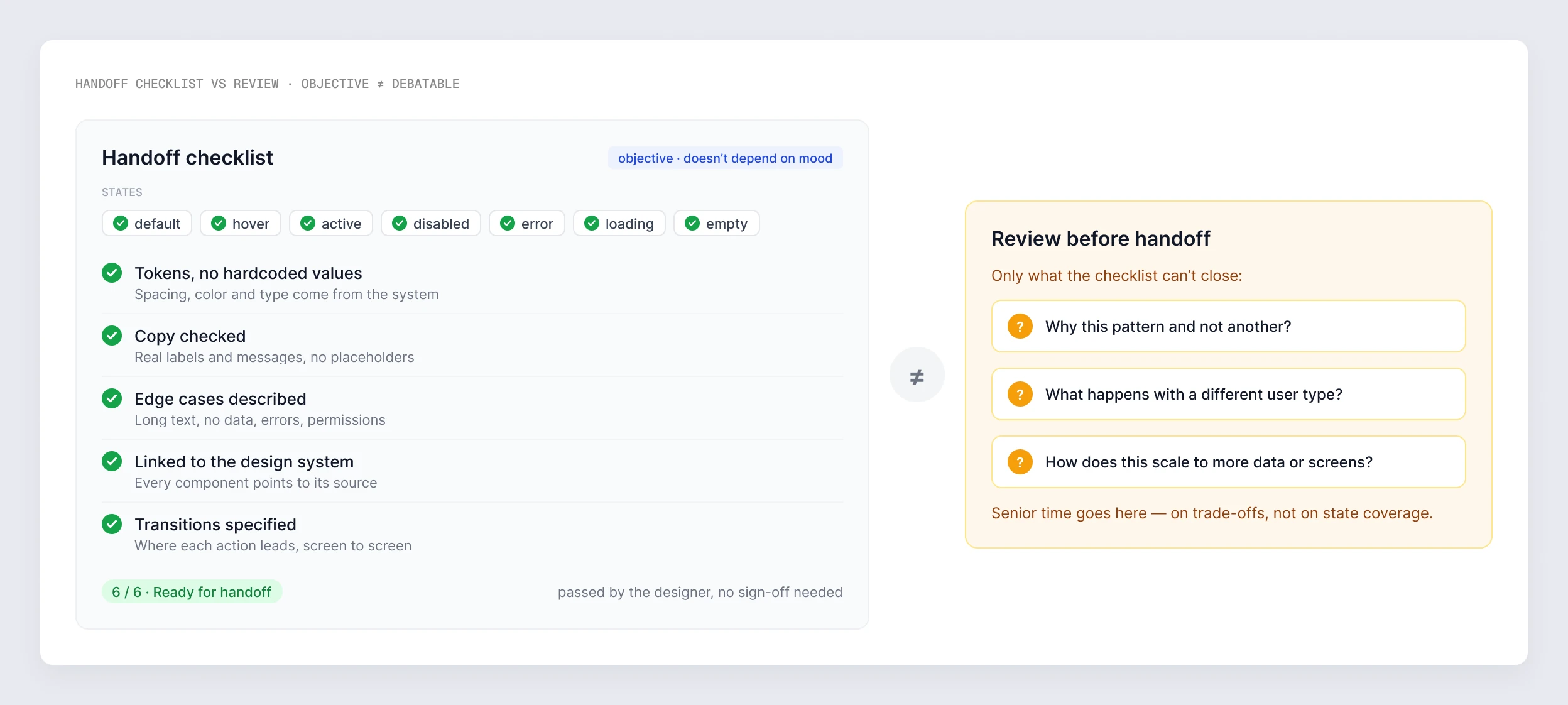
Handoff checklist versus review: the checklist holds the objective items — every state, tokens, copy, edge cases, DS links, transitions — and the review before handoff is kept for the questions the checklist can’t close Checklist v1 to v2: half of my original items removed after a 30-minute session with Frontend and QA, and new items added from their side — loading-state behaviour, keyboard focus order, edge cases as input and expected result

03

DECISION

Feedback day decoupled from current work

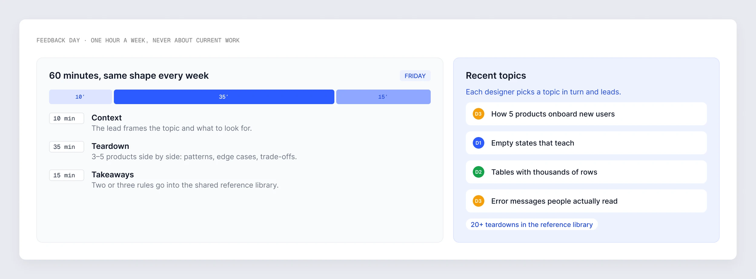
Discussing only current work gives designers local rules, not a general picture. One hour a week, never about current tasks — interfaces from other products, edge cases unrelated to our product, general UI/UX principles. A designer’s growth isn’t fixing specific screens; it’s building a reference library in the head. With 20 examples of “how different products solve onboarding,” the next onboarding task moves faster.

Feedback day: sixty minutes with the same shape every week — context, teardown, takeaways — and recent topics, each led by a different designer

04

DECISION

1-on-1 review only before handoff, not at every step

Reviewing at every stage trains designers to check in at any pretext — that’s not autonomy, that’s hand-holding. Available on request at earlier stages, but not as a required checkpoint. Final review before handoff is required, and the format is strict: the designer arrives with the checklist already passed, I ask about trade-offs and edge cases. Responsibility shifts from senior to tool.

The 1-on-1 review format: checklist check-in, three main points, trade-off questions, handoff sign-off — the first reviews had 8–10 points per screen, after the change three main points plus file comments

05

DECISION

Decision log as a mandatory artifact per task

Design decisions get lost. A month later nobody remembers why pattern A and not B. Per task — a short entry: problem, options considered with rejection reasons for each, choice, why, open questions. The designer who owns the task fills it in. Two effects: the team gets memory, and writing the log forces the designer to articulate the choice in words. The decision log is self-review disguised as documentation.

Decision log template v1 to v2: from a placeholder entry to one with the problem, the options considered with rejection reasons, the choice, why, and open questions

06

DECISION

Easing the mandatory review

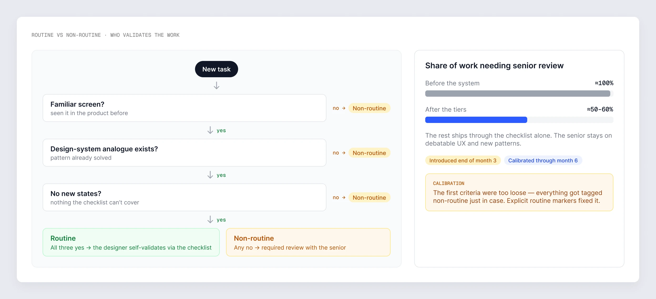
By month three the designers passed routine tasks without review — keeping mandatory review meant holding them in dependence after they’d outgrown it. Tiers introduced: routine (familiar screens, DS analogues exist, no new states) → the designer validates their own work. Non-routine (new patterns, debatable UX) → required review. The tiers landed last and took the longest to calibrate: the first criteria were too loose. Designing the exit from control mattered more than the length of the data.

Routine versus non-routine: three questions decide whether a designer validates the work through the checklist or needs a review — the share of work needing senior review fell from about 100% to 50–60%

05 — ARTIFACTS

What exists, what you can see.

01

Handoff checklist

States, tokens, copy, edge cases, DS links — rebuilt jointly with Frontend and QA

02

Decision log (template + examples)

Problem, options with rejection reasons, choice, why, open questions

03

Feedback day structure

Topics, rotating format (each designer leads in turn), examples of interfaces analyzed

04

1-on-1 review format

Checklist check-in → 3 main points → trade-off questions → handoff sign-off

05

Routine vs non-routine criteria

When a designer validates their own work, when review is required

06

Feedback from designers, PM and Frontend

Qualitative assessment of changes over the period

06 — KEY INSIGHT

Design quality should be a property of the system, not of one person.

The easy way to hold quality in a small team is for the senior to look at every screen. That works fast, but the process becomes senior-dependent. Any distraction, time off, deep work on something else — and the team’s design quality drops with it. The designers, meanwhile, don’t grow systematically — they grow reactively, by trying to guess the reviewer’s taste.

The right way is to move the objective part of quality out of the senior’s head and into team tools. The checklist covers what shouldn’t depend on mood. The decision log stores decision memory. Feedback days build shared criteria. Routine vs non-routine separates “ship without review” from “needs a trade-off conversation.” Senior plugs in only where actually needed — on debatable decisions, not on state coverage.

It’s the same systems thinking as in the Design System case: there, developers find answers in Storybook instead of asking the designer. Here the same idea is applied to the team’s design process instead of components.

A senior designer in a small team isn’t the one who controls everything — they’re the one who designs systems that don’t need control anymore.

07 — REFLECTION

What I’d do differently.

01

Launch the decision log on day one — with the options structure from the start

Before the log, decisions weren’t recorded anywhere, and part of the history had to be reconstructed from memory and chat threads. The first template was too short and invited placeholder entries — the log only became a thinking tool after the second version with mandatory option fields. Starting with the “options + rejection reason for each” structure would have saved ≈2–3 weeks.

02

Introduce routine/non-routine earlier, with strict criteria from the start

I held mandatory review on everything longer than I should have — judging by the designers’ confidence on routine tasks, the moment to introduce tiers came by the end of month two; I introduced them at the end of month three. The first criteria version was too loose, and everything got tagged as non-routine just in case. The “easing point” should be planned in as a phase, with explicit routine markers from the start.

08 — WHAT’S NEXT

Where the system goes from here.

#01

“How we work” as an onboarding doc

By the end of the project the system lived in practice and partly in my head. The next designer who joins shouldn’t need it explained verbally: a short “how the design process works here” doc covering the four elements and when to use which.

#02

Extend the decision log to my own work

At the end of the project the log was mostly the designers’. Recording my own decisions in the same format is the next step — both as an example for the team and as memory for my own work.

#03

Quarterly retro on the process itself

Once a quarter, a short session with the designers — not about specific work, about the process: which of the four elements is working, what isn’t, what to add. During the project this happened sporadically; it should be a ritual.

NEXT CASE

CASE 03 / 05

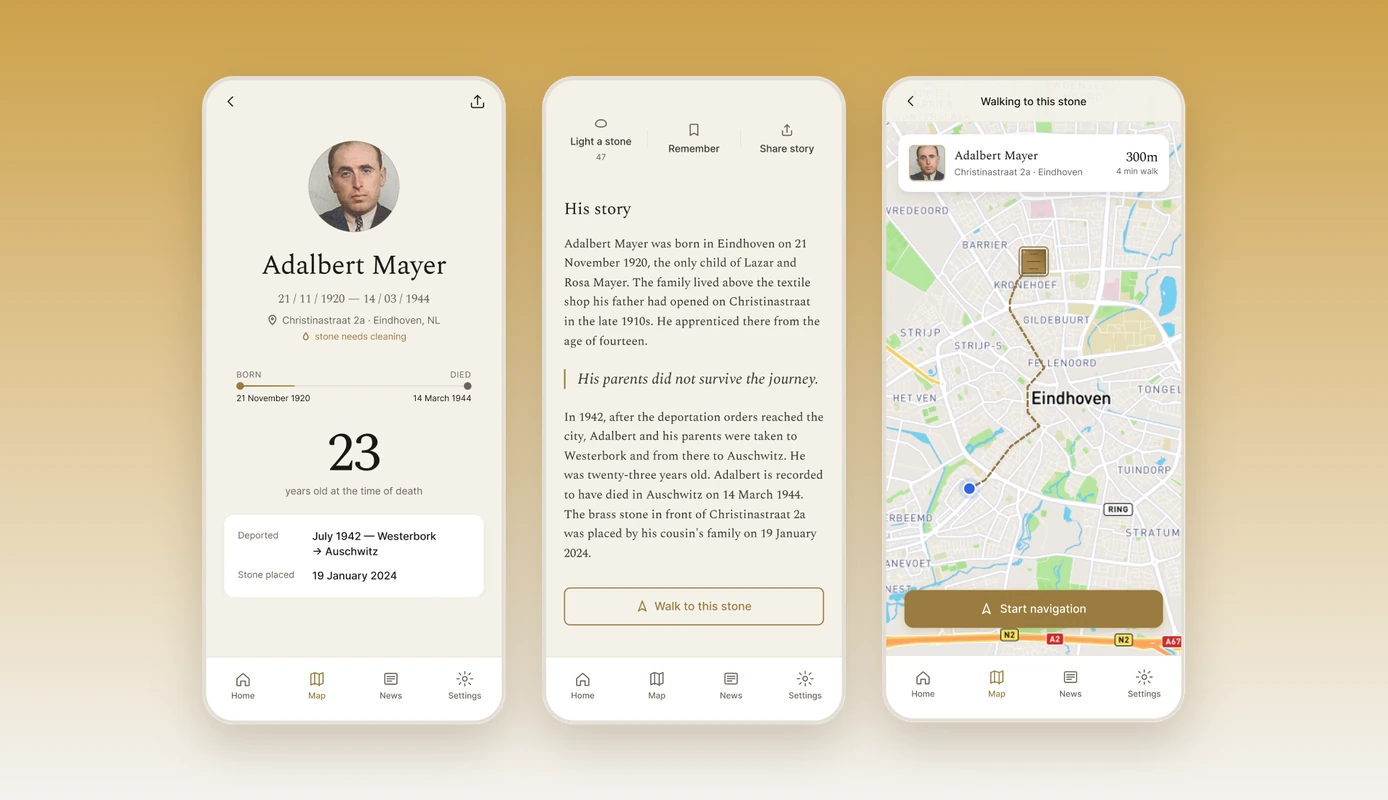
Stolpersteine case — victim profile, story and walking route screens of the memorial app

04

Memorial App for Holocaust Stolpersteine

A pro-bono memorial app, designed end-to-end — 12,000+ downloads and a Local Hero Award.

Pro bono · 2024